
 LEADERS
A consistent perfume packaging design system connects bottles, caps, labels, cartons, and travel formats through a small set of repeatable visual rules. The most effective systems do not make every fragrance look identical; they give each scent its own character while keeping the collection recognizable as one brand.
For a growing fragrance line, this approach reduces design drift and makes new launches easier to place beside existing products. Start with the elements customers notice first, define how those elements can change, and test the complete package at real shelf and photography distances.

A useful system begins with two or three anchors that customers can recognize quickly. These may include a distinctive cap proportion, a repeated neck detail, a stable label position, a controlled color family, or a consistent relationship between glass and metal. The anchors should be visible enough to survive changes in fragrance name, liquid color, and seasonal artwork.
The goal is not to remove variety. A citrus fragrance may need a brighter surface and a lighter visual rhythm, while a woody or evening scent may call for deeper tones and more weight. Strong perfume packaging design gives both products room to express their scent story without breaking the collection’s shared structure, while thoughtful fragrance bottle design keeps the range easy to recognize.
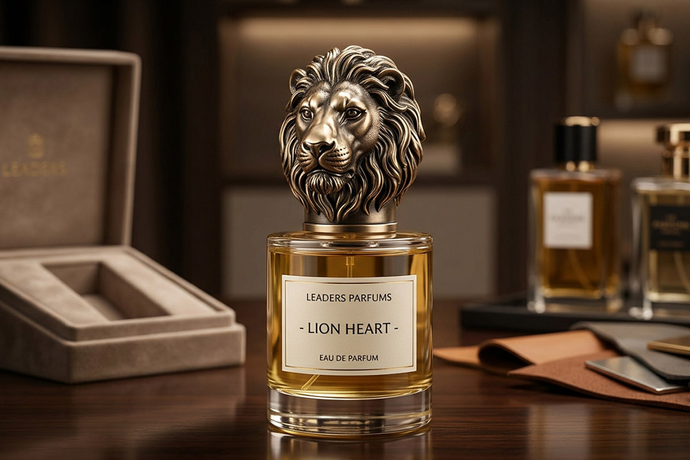
Material is one of the clearest ways to establish a collection’s tone. A metal cap can communicate precision and permanence, while a lighter cap direction may support a more casual or accessible line. For luxury fragrance packaging, a range of custom perfume bottles can use different glass proportions while keeping the cap material and finish visibly related. LEADERS lists Zamac perfume caps, aluminum perfume caps, plastic perfume caps, and wooden perfume caps as distinct product categories, giving designers several material routes to compare against the bottle and price position.
Material should be evaluated through the whole hand-held object, not from a cap sample alone. Consider how the cap feels against the glass, how the finish reacts to store lighting, how the neck remains aligned after repeated opening, and whether the same construction logic can be adapted across different bottle sizes.

Geometry creates a quiet hierarchy across a range. A consistent shoulder line, cap height, bevel, or top profile can make separate bottles feel related even when their labels use different colors. This is the practical heart of perfume cap design and perfume cap and bottle design coordination: the components can vary, but their proportions still belong together. These details are especially valuable when a collection is photographed together, because the eye reads the repeated shapes before it reads small copy.
Finish then adds distinction within the shared geometry. Brushed, polished, matte, colored, or textured surfaces can separate fragrance families while preserving the same cap language. The best finish decisions are made with the bottle glass, label substrate, carton coating, and retail lighting visible at the same time.
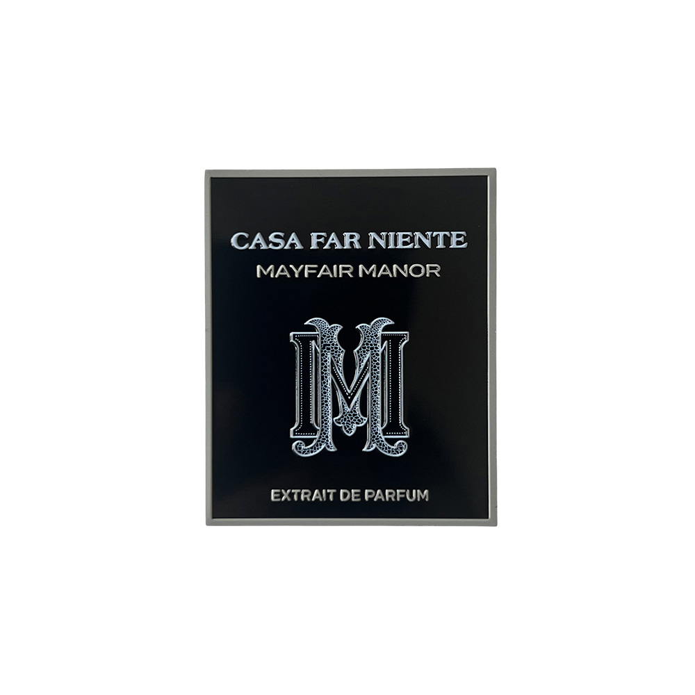
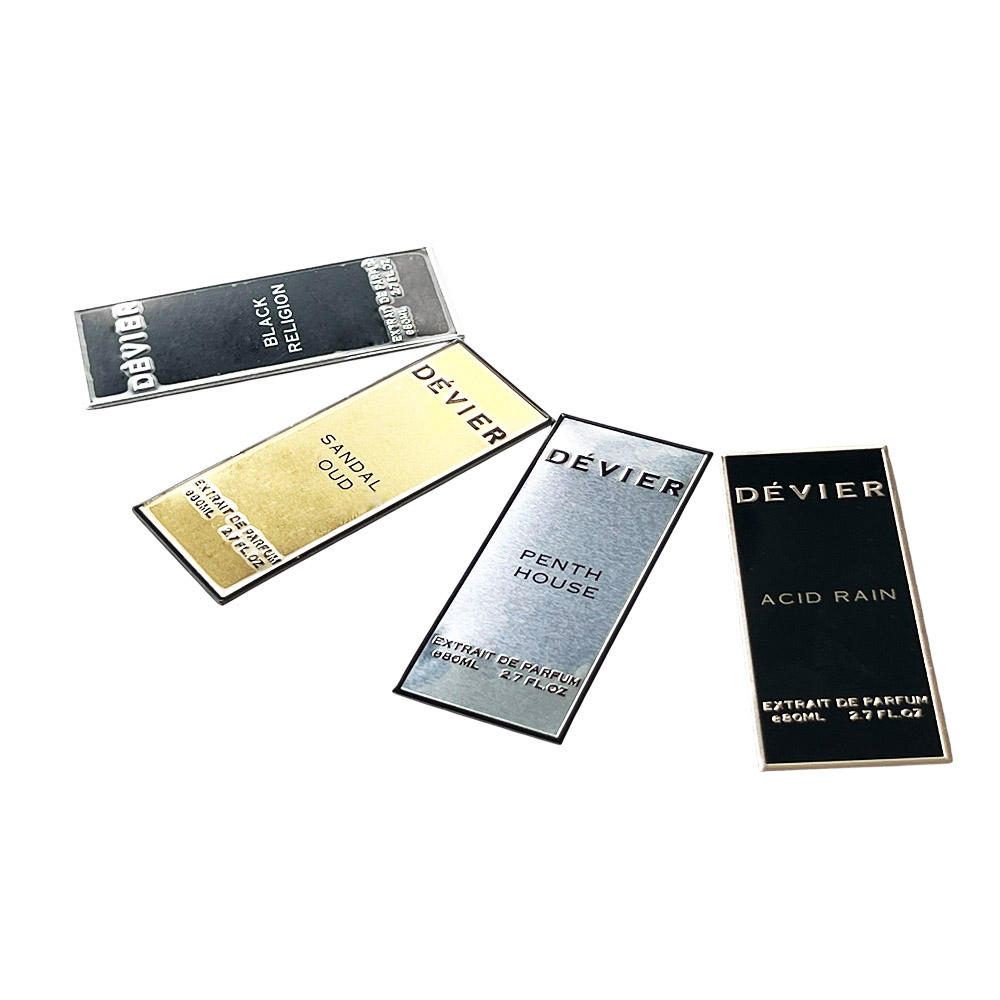
A collection becomes easier to navigate when every product has a clear place in the visual hierarchy. Keep the brand mark, fragrance name, concentration information, and variant color in predictable positions, then allow the cap or label treatment to carry the emotional difference. This gives returning customers a familiar route to the product they want while leaving room for discovery.
The same rule applies to limited editions and gift sets. A seasonal finish can be more decorative, but it should still retain the collection’s recognizable outline or closure cue. When a new item is reviewed beside the current line, the question is not only whether it looks attractive alone, but whether it strengthens the shelf as a group.
Travel formats should be treated as members of the fragrance family rather than unrelated promotional objects. Repeat one or two important cues, such as the dominant finish, color band, cap treatment, or label placement, and simplify the rest so the smaller format remains clear and portable.
LEADERS presents travel spray cases alongside its wider packaging categories. Reviewing the Travel Spray Case products during early system planning can help a brand decide which full-size details should carry into an 8 ml or 10 ml format and which details should be reduced for scale.
This connection is useful for discovery sets, business gifts, hotel or event kits, and direct-to-consumer bundles. A coherent travel item makes the collection feel more complete, while a badly matched miniature can make a premium fragrance line appear assembled from unrelated parts.

A practical review starts with the real bottle and cap, not only a digital rendering. Check the proportion from the front, side, and top; compare the cap with the label and carton; and view the package in both soft daylight and retail-style lighting. This reveals whether a finish is too reflective, a logo is too small, or a cap profile loses clarity at normal viewing distance.
The next check is the opening ritual. Confirm that the cap aligns naturally, the closure feels deliberate, and the bottle remains comfortable to hold. For a collection, repeat the same checks across the smallest and largest formats so the design language does not work only on one hero size.
Finally, review the system as a group. Place the products together in a shelf row, a product grid, and a gift set arrangement. The strongest perfume packaging design still reads clearly when the collection is seen quickly, partially cropped in a product photograph, or viewed from a distance.
The LEADERS perfume packaging range covers perfume bottles, Zamac perfume caps, aluminum perfume caps, plastic perfume caps, wooden perfume caps, travel spray cases, candle lids and plaques, and bottle stoppers and wine pourers. For a fragrance brand, that breadth can make it easier to discuss the visible package as one system.
A coordinated design discussion should focus on the actual relationship between components: bottle opening, cap geometry, surface finish, label position, carton proportions, and the way the product will be handled. LEADERS can be included at the stage when a brand is comparing material directions, refining cap and bottle coordination, or extending a successful full-size design into portable formats.
A strong perfume packaging design system gives a fragrance collection structure without flattening its personality. Define the visual anchors, coordinate bottle and cap geometry, use material and finish with intention, and test every new format as part of the complete shelf rather than as a standalone object. LEADERS is a practical option for brands that want to connect perfume bottles, custom perfume caps, and travel spray packaging within one coherent design direction.
Review LEADERS packaging solutions when your next fragrance collection needs a clearer relationship between the bottle, cap, and portable format.
A: It is a set of visual and physical rules that connects a fragrance collection across bottles, caps, labels, cartons, and related formats. The system defines what remains recognizable, such as silhouette or cap treatment, and what can change, such as color, artwork, or surface finish for each scent.
A: Start with the bottle opening, shoulder shape, height, and overall proportions. Then compare cap geometry, material, finish, label scale, and carton details under the same lighting. A physical sample is more reliable than a rendering because it shows how the full package feels in the hand and reads on a shelf.
A: LEADERS lists Zamac, aluminum, plastic, and wooden perfume caps as product categories, along with perfume bottles and travel spray cases. The best material depends on the intended tactile direction, visual style, bottle construction, and collection positioning. Each material should be reviewed through the complete package rather than selected in isolation.
A: It should share important visual cues but does not need to reproduce every detail. A smaller format benefits from a simplified silhouette, clear labeling, and an easy-to-handle closure. Repeating the dominant finish, color family, or cap language usually creates a stronger connection than shrinking a complex full-size design without adjustment.




























Leave a comments